Custom Reports and Graphing
Custom Reports and Graphing
Here’s how our survey’s with the unique one of a kind back end system, the A L R program, puts you in control of your online surveys:
- Flexibility to have YOUR look and feel for your customer’s survey experience
- Take your reports with you
- Share with your team
- Keep it simple
[spacer height=”20″]
Custom Reports
Sort through your data
- A mountain of data does you no good if it doesn’t help you take action. Use our real-time reporting features to analyze, make data-driven decisions, and work smarter.
Make Sense of Your Data
- Our reporting features make it easy to create summary reports to get a bird’s-eye view of your survey responses. If you need more powerful analysis, export your data to SPSS or CSV and crunch through complex statistical analysis using your own tools
Share With Your Team
- Four eyes are better than two (and we don’t necessarily mean people wearing glasses). In addition to viewing reports online, our survey software lets you export your reports to PDFs and even password-protect your reports, so you can choose the most convenient way to share your data.
Customize Your Reports
- Don’t like our default reports? You can customize your reports to your heart’s content. We let you change colours, add logos, and create branded reports using CSS. You can also customize reporting values and create graphs and charts to build the exact report you need.
Set Your Own Schedule
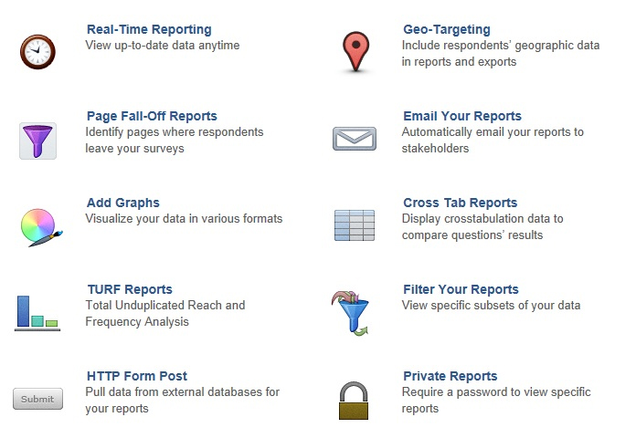
- Need a report to run regularly? Not a problem. Our Report Scheduler helps you schedule survey reports to run hourly, weekly, or monthly, keeping you up-to-date on what’s happening with your survey. You can even automatically e-mail your reports to key stakeholders.
Real-Time Reporting
You should have access to your most recent data whenever you need it, so we developed our application so that you can view and export your most recent data at anytime. Data collected using Compechek is updated in close to real time (sometimes there may be a slight delay due to high traffic days, but those are few and far between). Each time you run a report or an export, the most current survey responses will be included unless you specify otherwise (filtering Reports and Exports become available at the Professional Level accounts). Being able to access the most recent data on your survey helps you do your job! It can keep you in the loop on how your survey is going, or help you update your stakeholders, clients, or even co-workers with the latest results from your survey.
Summary Reports
From the first response you collect you can automatically start creating graphs and averages from your data to visually display your responses. The graphs and charts are customisable so that you can clearly display you response data with either your answer options or reporting values. Summary Reports are available to all plan levels, but starting at the Professional level you can filter your Summary Report based on specific criteria, and starting at the Enterprise level, you can have Reports emailed to up to five people on a scheduled basis. If you’re looking for a quick way to distribute your data to your client or co-workers, you can easily do so by using a Summary Report. It helps you to visually display your aggregate data that you’ve collected on your survey, and can help you with basic analysis (such as sum, average, min and max) for certain question types.
Browse All Responses Individually
Here at Compechek, we realize that you may need to look at your data in many different ways. That is why on top of your normal reporting and exporting features, all account levels can view individual responses in a transcript format. It provides you a simple breakdown of the survey questions, and answers that were provided by the respondent. For all of our paid accounts, you also have the option to download the individual responses as PDF’s. You may not want to view your data in an aggregate fashion, and may find it beneficial to see a basic breakdown of each question that was answered by a specific respondent. This feature is great because it allows you to view responses individually, and easily move between them.
Graphing
This feature allows you to create graphical representations of your data. Within our Summary Reports, you can set up two different graph types: pie charts and bar graphs. When creating a summary report, these graphs will be automatically generated. You can turn them off at any time by reducing their size to 1 px. When creating a report, you are given the option to use graphs to represent your data, which can be helpful in many situations! Your clients may want to see a quick visual representation of your data without having to sort through tables of numbers. In general, graphs are a nice and clean way to display your aggregate data, and can help you provide a more colourful presentation.


